REBRAND // PACKAGING
Boochy Mama’s
Kombucha
Client: Stacy Jurich, Boochy Mama’s Kombucha
Product/Lifestyle Photography: Jennifer Beachy
A beloved staple of the Toledo food & beverage scene, Boochy Mama’s Kombucha came to me with an exciting challenge to refresh the existing brand after nearly ten years in business. In addition to a shift in packaging from bottles to cans, the brand’s visual storytelling needed enhancement to better align with Boochy’s health-conscious and naturally-skewed identity. Owner Stacy offered the ultimate designer’s dream: free-reign to develop an identity and packaging system that would help the kombucha line stand out in a competitive marketplace.


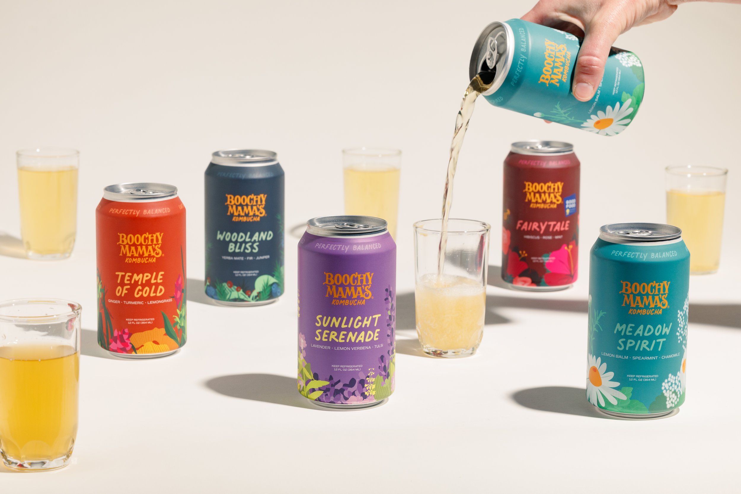
Plenty of health-conscious beverage brands tend to rely on whitespace and clean aesthetics to show their commitment to no-frills drinks. In ultimately determining that visualizing the botanical profiles was a way that Boochy Mama’s could stand out, we leaned all the way in with custom illustrations for each flavor. The floral (and faunal) landscapes wrap entirely around each can, bursting with vibrance and quirk.

The long-standing Boochy Mama’s wordmark was so imbued with character that it ultimately felt wrong to overhaul completely. It was clear that to further the charm of the brand name, it was necessary to swap in a hand-written “kombucha” below to better relate to the overall brand visual system. This handwritten motif found its way on all of the packaging typography—a welcome shift that hints to Boochy’s hand-crafted ethos.


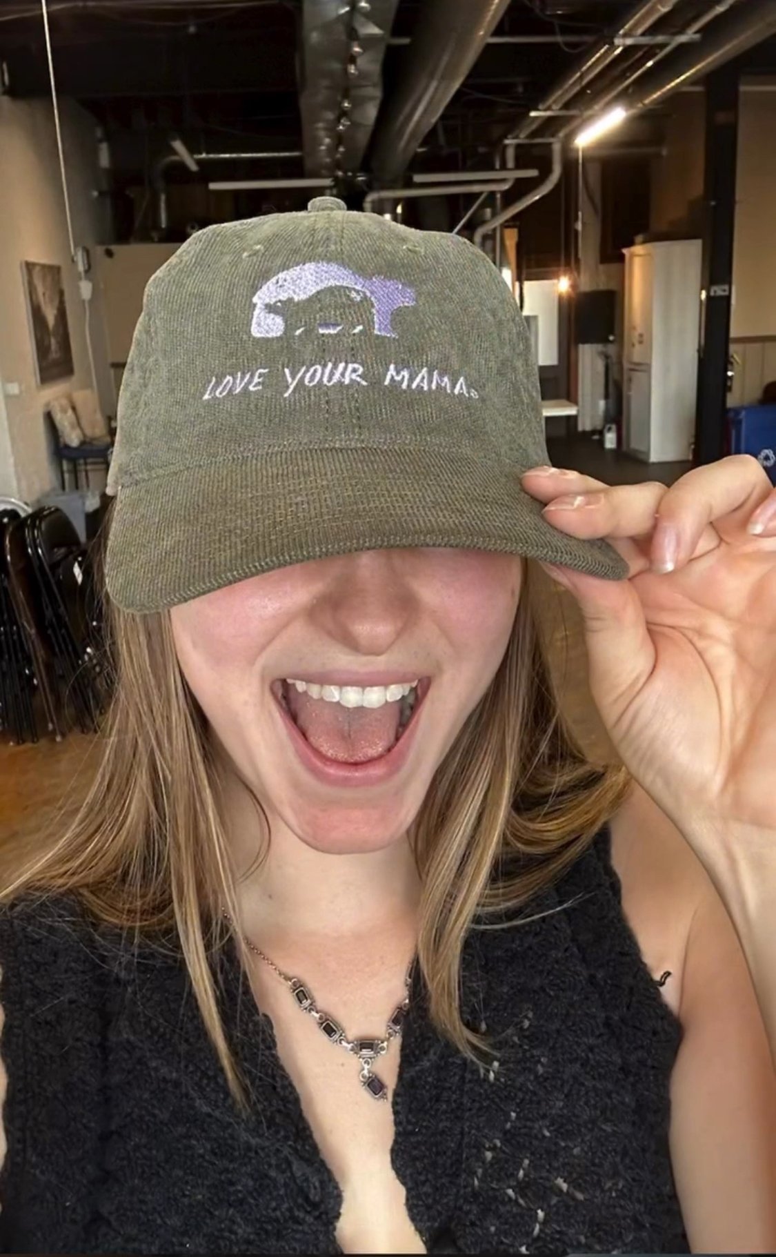
There was one element from Boochy Mama’s original brand palette that took a back seat during the rebrand process: originally the face of the beverage, a hand-drawn mama bear didn’t feel like the hero for this iteration of the kombucha brand. That said, there was no way she was going away wholesale–now with her cub in tow, mama found new life in a new illustration style and has been the star of all Boochy merchandise!